Mobile App Design for a Seamless Checkout
Overview
Tava Ski Resort App is a conceptual self-initiated project based on a favorite local, family-owned ski resort our family holds season passes to. This ski resort does not currently have an app and it was a great opportunity to get my family involved and show them what product design is.
This is also a way to show my design process with restrictions of not being able to share NDA protected work.
My role
Product designer – personal project with my husband and son
Scope of work
The goal was designing an app for their customers that provides a seamless checkout flow with a coupon code area for the MVP (minimum viable product). They often mail local residents postcards with a coupon code but currently the only way to redeem is in-person, standing in a long line which is often a hassle and delays your first run of the day.
Methods explored: User interviews, Journey Mapping, Task Flow, Competitor Analysis, Wireframing, Prototyping, two rounds of Usability Testing and Iterations

Goals
identify common task flows with making online purchases from a ski resort
uncover user frustrations
identify features skiers and snowboarders are seeking to earn loyalty by enhancing their experience
Understanding the user
Generative Research / User Interviews
I conducted remote 1:1 user interviews and several hallway interviews on location at the local ski resort. I uncovered their goals and frustrations and created 2 distinct personas to different user categories. This included the budget single day lift shopper and the season pass holder looking for app features to enhance their experience while on the mountain looking for their next run.
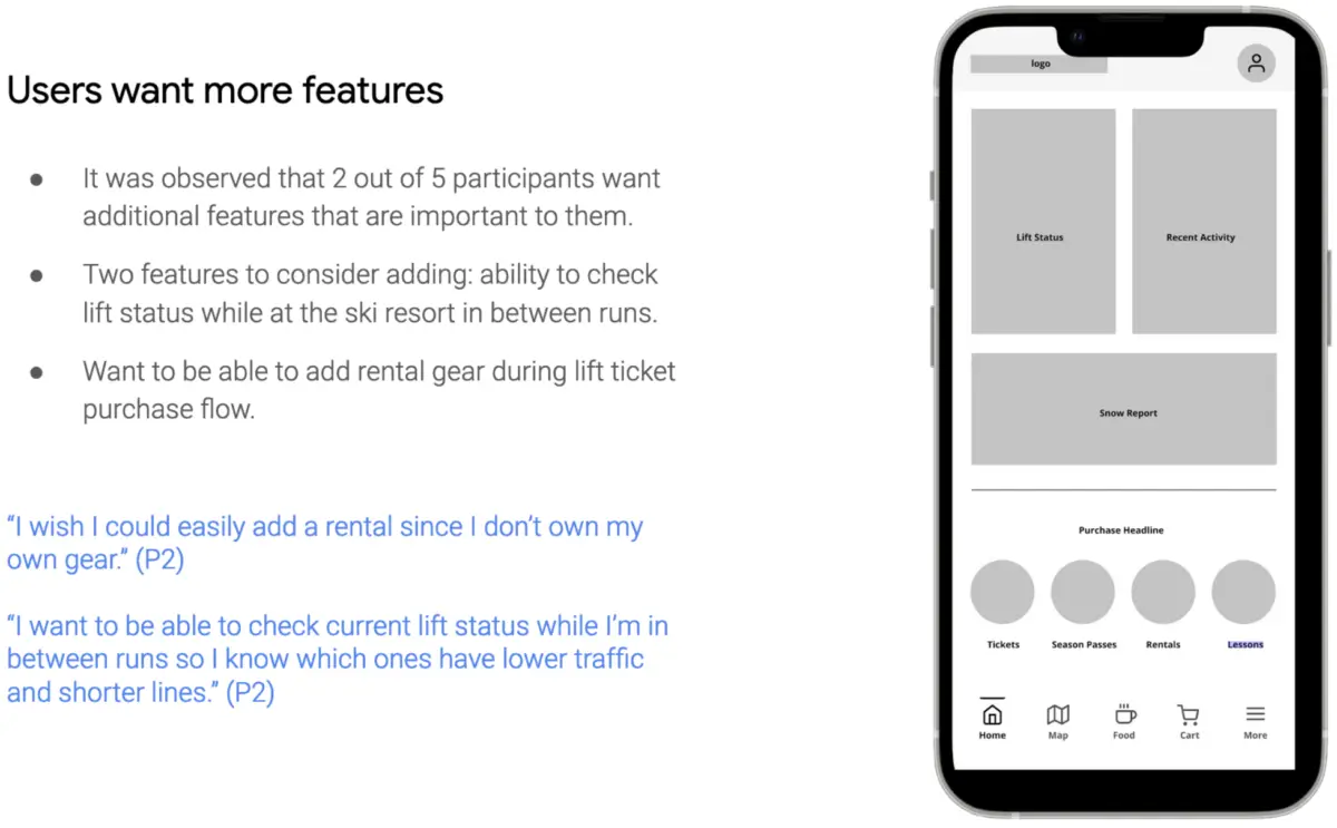
These interviews confirmed my assumptions regarding the need for a coupon code field during online checkout and also revealed additional frustrations such as ways to avoid long lift lines and ability to rent equipment during lift ticket checkout.
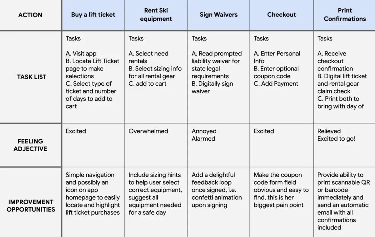
User Journey Map
Mapping the process of purchasing a lift ticket and planning for a day on the slopes revealed how it would save money to be able to purchase a lift ticket in advance with an easy to use app while saving time in the morning by avoiding the ticket line. It always helps to write out the steps the user goes through in buying a ticket so we can design for each step so we don’t miss even the smallest interactions.
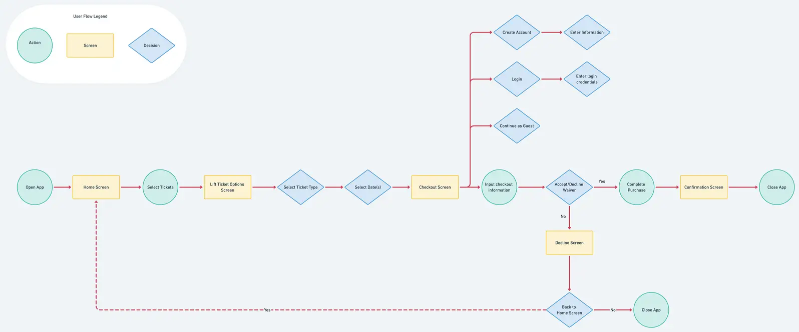
Task Flow Analysis
Taking the user journey map insights, I mapped out the task flow for the purchase/checkout process.
The Problem | Solving for 2 User Groups
01 Persona: Single Day Visitors
Budget-conscious ski and snowboarders want an easy way to plan their day at the ski resort by purchasing tickets and gear in advance with a coupon code because there is currently no way to enter this with an online purchase.
02 Persona: Season Pass Holders
Season pass holders want an enhanced experience at the ski resort by having tools to avoid long lift lines in order to make the most of their day while on the mountain.
Define & Ideate
With a clear understanding of the user’s challenges I could confidently investigate possible solutions.
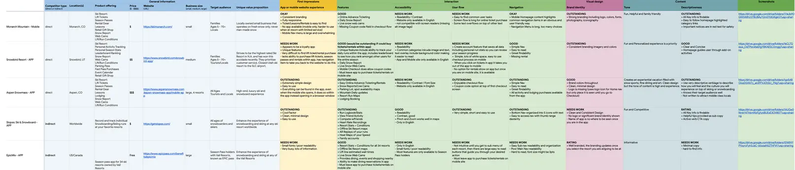
Competitor Analysis
By comparing the design of direct and indirect a competitor’s app or mobile site when an app was not available, I was able to take note what competitors were doing well and their opportunities to help see gaps in the market and opportunities for our product to stand out.
Opportunities Uncovered:
+ Must be an app, mobile site doesn’t provided enhanced features users want
+ Some checkout flows do not have a coupon code field in checkout
+ 4 out of 5 compared had no option to purchase lift tickets in-app
+ 2 out of 5 were overwhelmed with information, increasing user cognitive load
Wireframes
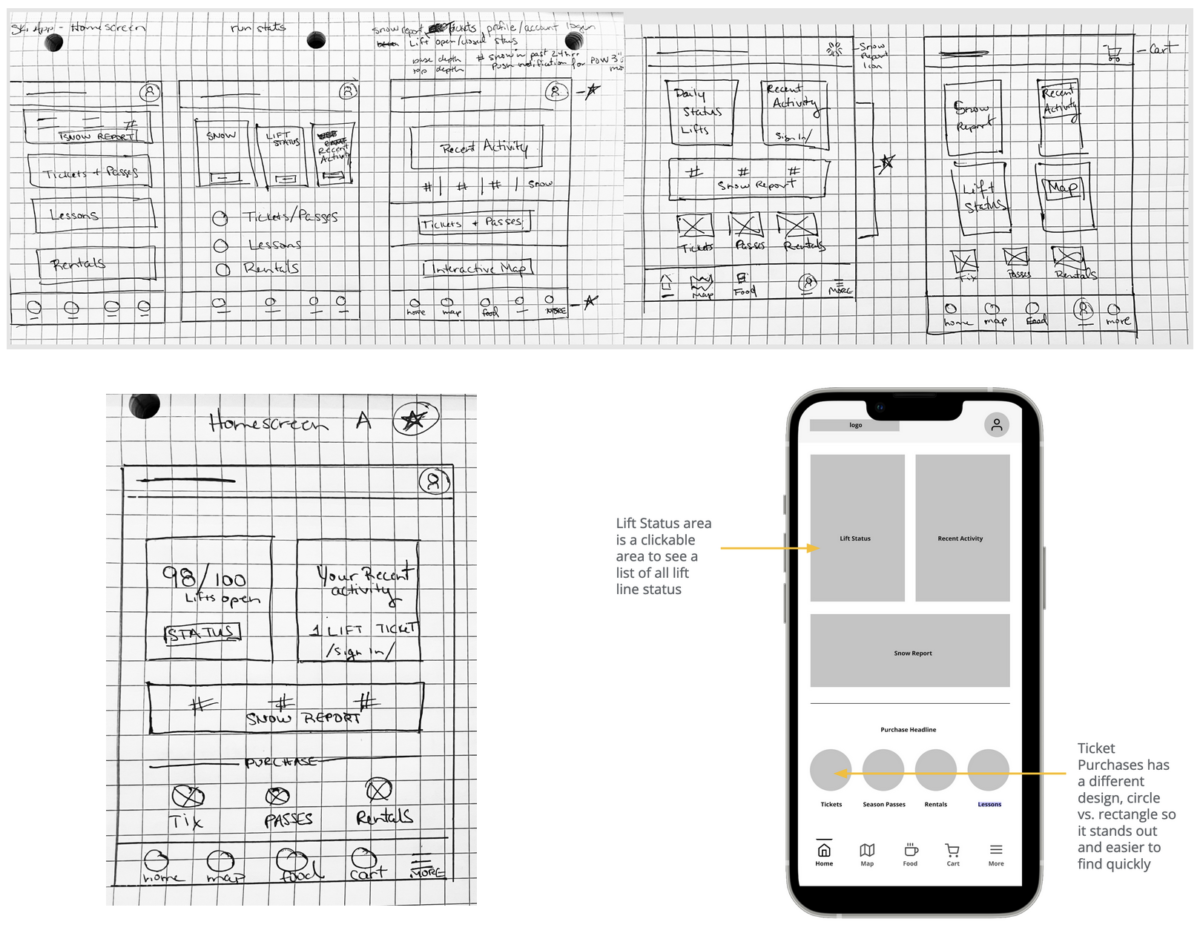
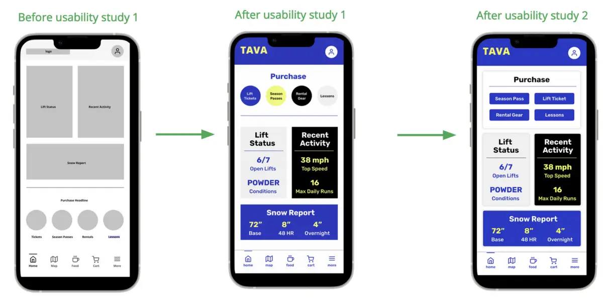
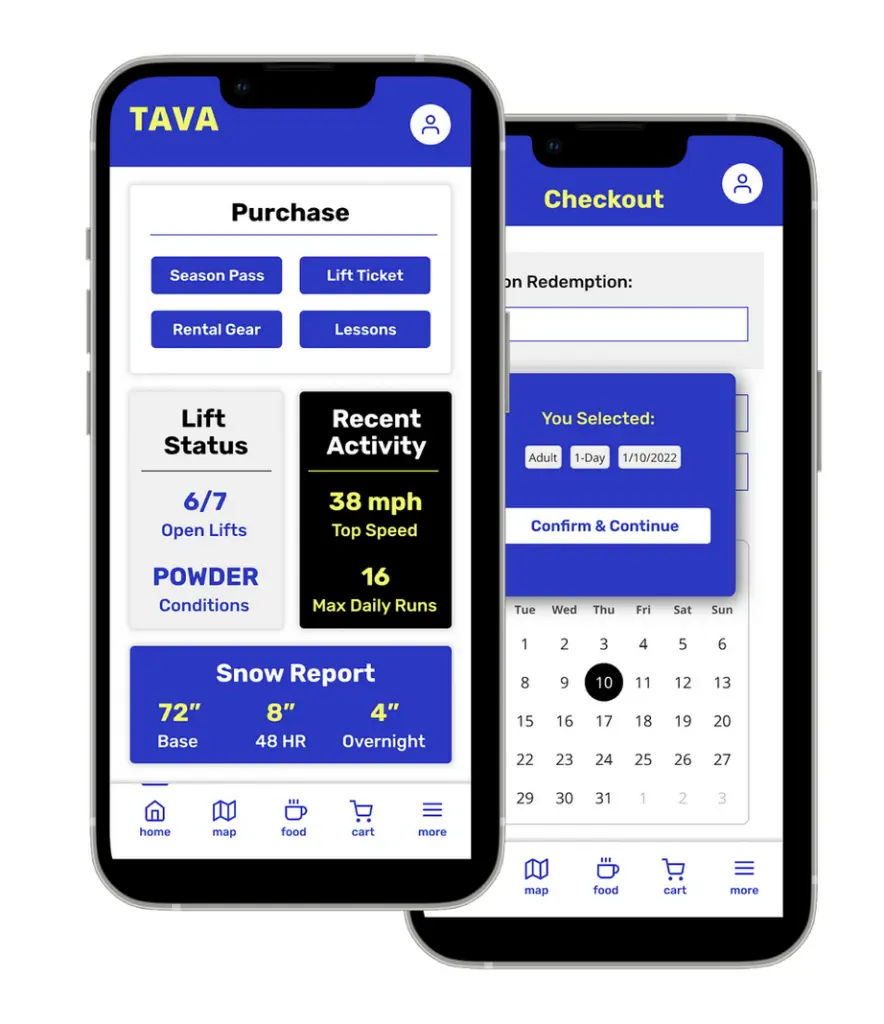
After capturing the big picture, wireframing began with rapid iterations of various possible layouts on paper for rapid brainstorming on how the home screen layouts would take place. The ability for a user to quickly locate and purchase a lift ticket was prioritized.
In the digital wireframes, I included the enhanced features user interviews had uncovered such as a lift line status area and an easy to find resort map icon in the bottom navigation as well as screens for the main user task flow would need for the checkout process.
Test
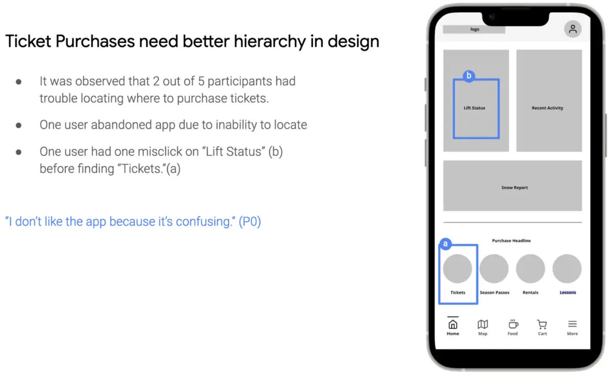
Low Fidelity Prototype | Usability Study #1
Utilizing Figma, I turned the digital wireframes into a prototype for the first usability test. I tested amongst 5 participants in a remote, unmoderated usability study utilizing Usability Hub. Three recurring themes were popping up once we organized the test data with an affinity map.
High Fidelity Prototype | Usability Study #2
With consideration from insights from the first round of usability tests, iterations were made to the design prior to the second usability test. A remote, unmoderated usability study was performed using Maze software.
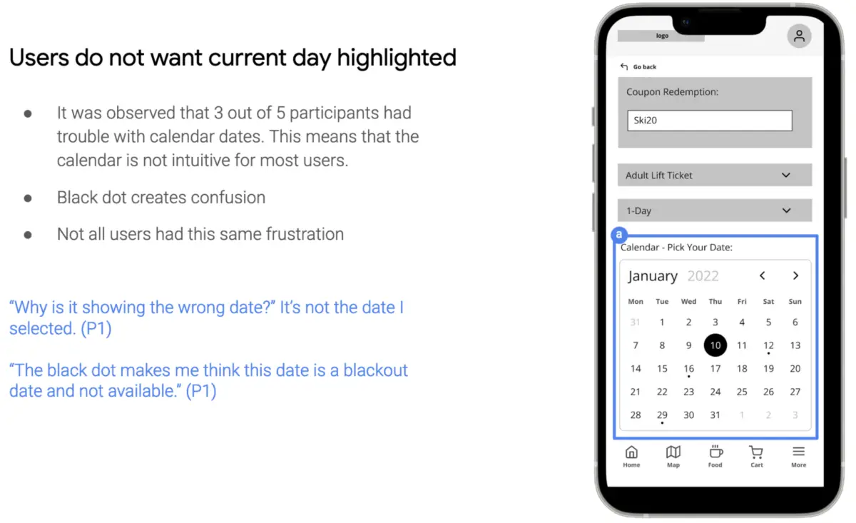
The second usability study revealed continued frustration with the lift ticket purchase button being too small.
There were no misclicks but multiple user feedback showed concern. I had moved the purchase menu to the top based on the first round of testing where users had trouble locating the ticket option.
Below are iterations of the home screen.
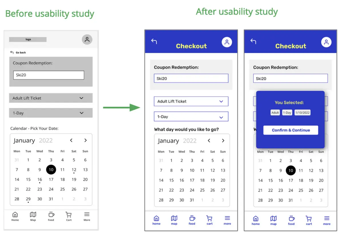
Users did not want the current day highlighted in the calendar within the checkout flow. Prior to the second usability test, I revised the calendar design so that only the day the user selected is highlighted and included a confirmation modal.
Below are iterations of the calendar screen and added confirmation modal.
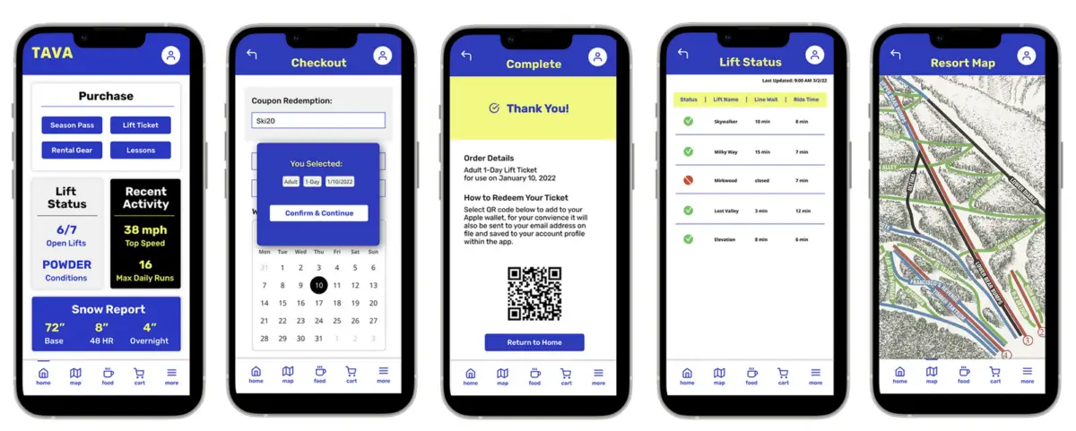
Figma Prototype
See below for the high fidelity interactive prototype.
UI Design
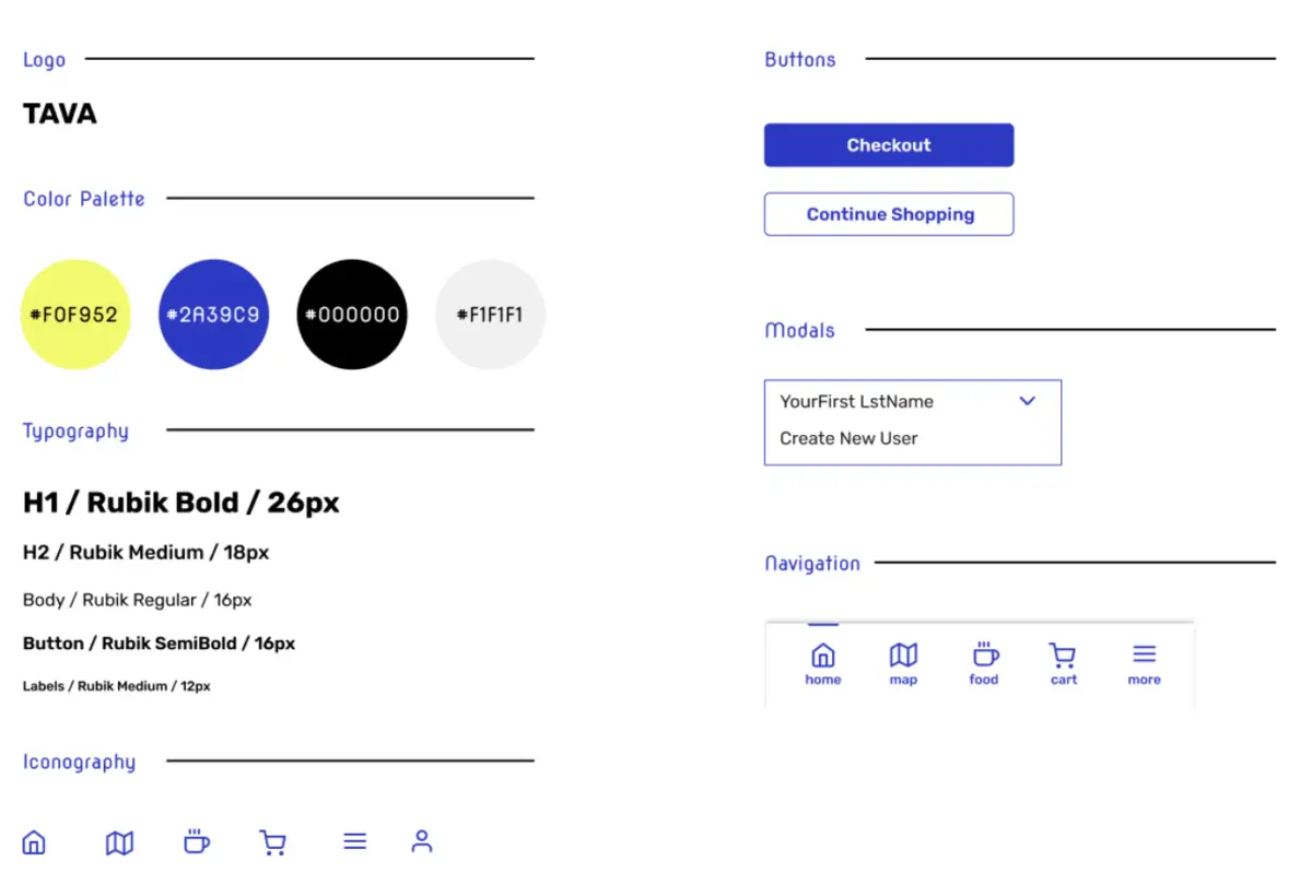
Consistent visual design was created throughout the app including Figma components.
Usability study participant quote
“The app is laid out in such a way that all tasks are easily accessible and vital items are always available.”
Reflection
It’s worth the time to do self-initiated projects occasionally to challenge myself to practice new skills or challenge existing skills with new restraints.
For usability testing, I engaged in-person hallway testing but also a round of usability testing with Usability Hub’s participant recruiting service. These participants were the least valuable and most did not completely engage or complete the usability testing. I did a second round of targeted recruiting through social media to replace with an engaged cohort.
Since snowboarding is a shared family hobby it also created some fun family discussions.